Double-Crown-Records

Joined: Feb 27, 2006
Posts: 1226


|

Posted on Mar 31 2015 04:13 PM
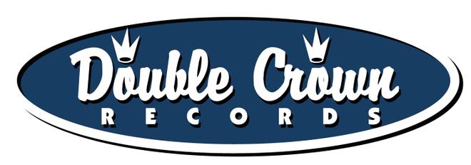
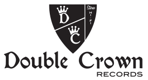
I'm working on a vinyl banner for our table at this summer's SG101 Fest, and would love some input as to which Double Crown Records logo is your favorite:
1) 
2) 
3) 
Please respond here, or via PM, with #1, #2 or #3.
— Sean
Double Crown Records
www.doublecrownrecords.com
Surf CD's / Vinyl / Fanzines / DVD's
Frankie & The Pool Boys - Endless Drummer LP / CD
Aloha Screwdriver - Lunar Wobble CD
Continental Magazine - Issue #39 With Compilation CD
|
revmike

Joined: Feb 26, 2006
Posts: 3864
North Atlantic


|
Posted on Mar 31 2015 04:33 PM
#1 for a banner
#2 is my favourite overall.
Rev
— Canadian Surf
http://www.urbansurfkings.com/
Last edited: Mar 31, 2015 16:41:23
|
heepeejeep

Joined: Feb 28, 2013
Posts: 350

|
Posted on Mar 31 2015 05:08 PM
obviously nr.1 
|
ElMonstroPorFavor

Joined: Sep 01, 2006
Posts: 2758
New Orleans, LA
|
Posted on Mar 31 2015 05:18 PM
|
ElMonstroPorFavor
Joined: Sep 01, 2006
Posts: 2758
New Orleans, LA
|
Posted on Mar 31 2015 05:18 PM
oh dear I did not realize what that pound sign would do
— Storm Surge of Reverb: Surf & Instro Radio
|
Teiscofan

Joined: Feb 21, 2011
Posts: 513
Ontario
|
Posted on Mar 31 2015 05:23 PM
Number 1 is styling in a retro way.
— I am not obsolete, I am RETRO....
|
wfoguy

Joined: Dec 11, 2011
Posts: 2139

|
Posted on Mar 31 2015 07:46 PM
No. 3 for me. I am older than most. 
|
bigtikidude

Joined: Feb 27, 2006
Posts: 25726
Anaheim(So.Cal.)U.S.A.
|
Posted on Mar 31 2015 08:12 PM
All 3 are cool,
But number 1 will look awesome on a banner.
Can't wait to see you again Sean.
And thanks for being a sponsor and for everything you do to help the surf
Comunity.
— Jeff(bigtikidude)
|
JakeDobner

Joined: Feb 26, 2006
Posts: 12159
Seattle
|
Posted on Mar 31 2015 08:14 PM
Number 2 is the best, in this man's opinion.
Have you thought about "Double Crown" red for number 2? Keep 'records' and the 'coat of arms' in black.
|
DannySnyder

Joined: Mar 02, 2006
Posts: 11079
Berkeley, CA

|
Posted on Mar 31 2015 08:22 PM
I like #3
— Danny Snyder
"With great reverb comes great responsibility" - Uncle Leo
I am now playing trumpet with Prince Buster tribute band 'Balzac'
Playing keys and guitar with Combo Tezeta
Formerly a guitarist in The TomorrowMen and Meshugga Beach Party
Latest surf project - Now That's What I Call SURF
|
DesignSpy

Joined: Jun 19, 2013
Posts: 182
Augusta, Georgia
|
Posted on Mar 31 2015 08:25 PM
|
mom_surfing

Joined: Feb 27, 2006
Posts: 5324
the outer banks of north carolina
|
Posted on Mar 31 2015 08:27 PM
1 for banner
3 my favorite
— www.surfintheeye.com
|
mom_surfing
Joined: Feb 27, 2006
Posts: 5324
the outer banks of north carolina
|
Posted on Mar 31 2015 08:29 PM
ElMonstroPorFavor wrote:
oh dear I did not realize what that pound sign would do
nor did i 
— www.surfintheeye.com
|
JakeDobner
Joined: Feb 26, 2006
Posts: 12159
Seattle
|
Posted on Mar 31 2015 08:37 PM
I'd also throw out the possibility(if it is a table skirt type banner) that you could, on option 2, move the coat of arms to the left and have "double crown records" to the right of it.
|
Baine

Joined: Mar 08, 2008
Posts: 197
NJ shore
|
Posted on Mar 31 2015 09:29 PM
I like 3, 1 is good for a banner
— "We're lousy, we can't play. If you wait until you can play, you'll be too old to get up there. We stink, really. But it's great," Johnny Ramone .
|
Double-Crown-Records
Joined: Feb 27, 2006
Posts: 1226
|
Posted on Mar 31 2015 11:50 PM
Well this is pretty funny so far - seems like the votes are pretty equally split amongst all three logos!!!
— Sean
Double Crown Records
www.doublecrownrecords.com
Surf CD's / Vinyl / Fanzines / DVD's
Frankie & The Pool Boys - Endless Drummer LP / CD
Aloha Screwdriver - Lunar Wobble CD
Continental Magazine - Issue #39 With Compilation CD
|
JakeDobner
Joined: Feb 26, 2006
Posts: 12159
Seattle
|
Posted on Mar 31 2015 11:59 PM
I'm voting for 2 a second time. It is really an awesome logo. Great type, classy 'coat of arms'.
I do really like the crowns logo, but the type at the bottom could be a fresher typeset and URLs don't belong on things anymore. What about the Crowns logo with the second logo's font(and I would keep the 'records' below as well, that is sharp)
|
PolloGuitar

Joined: Feb 26, 2006
Posts: 5139
San Francisco
|
Posted on Apr 01 2015 12:03 AM
Sean, I like #1 the best. It's classy, it's the original, and it was designed by Rip Thrillby. No to be nostalgic, because that guy was GOOD!
— Buy Endless Drummer @ Bandcamp
Frankie and the Pool Boys website
Buy Speed of Dark @ Bandcamp
Pollo Del Mar website
My Blog- Euro Tour Blog
Pool Boys on Spotify
INSTAGRAM
Frankie & The Pool Boys on Facebook
Pollo Del Mar on Facebook
DJ Frankie Pool Boy on North Sea Surf Radio
|
arny

Joined: Aug 22, 2010
Posts: 614
Netherlands, Europe

|
Posted on Apr 01 2015 01:30 AM
|
da-ron

Joined: Jan 02, 2009
Posts: 1307
The original Plymouth, UK.

|
Posted on Apr 01 2015 02:53 AM
1 for a banner
2 for a flag
3 is my least favourite. In fact I don't like it at all!
— http://thewaterboarders.bandcamp.com/
|